A logo by definition is, ‘a symbol or other small design adopted by an organisation to identify its products, uniform, vehicles, etc.‘
Logos are so significant and to me, it symbolises more than just my work. It symbolises me.
Over the course of Teecaake, I have taken the liberty of designing my own logos and they have progressed and evolved with time as I have. And there is no doubt, they will continue to do so in the future.
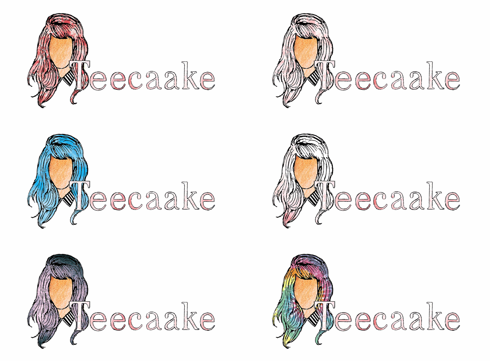
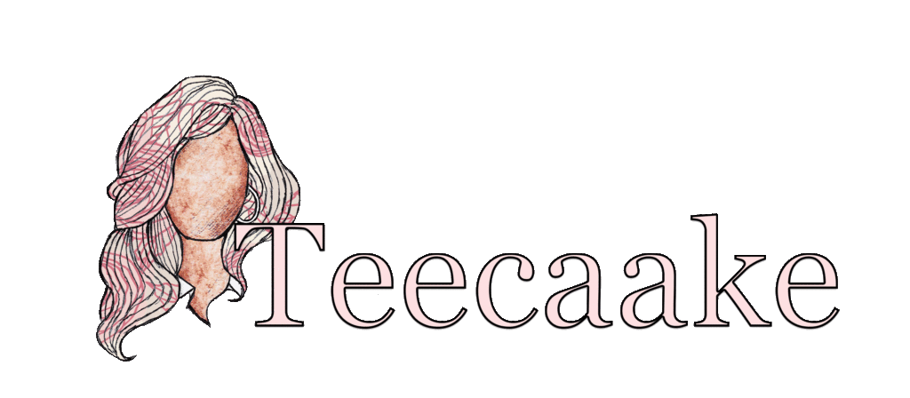
- I made the text crisper and more readable.
- I kept the size ratio the same as I appreciate that is an aspect that was already a positive from my previous logo.
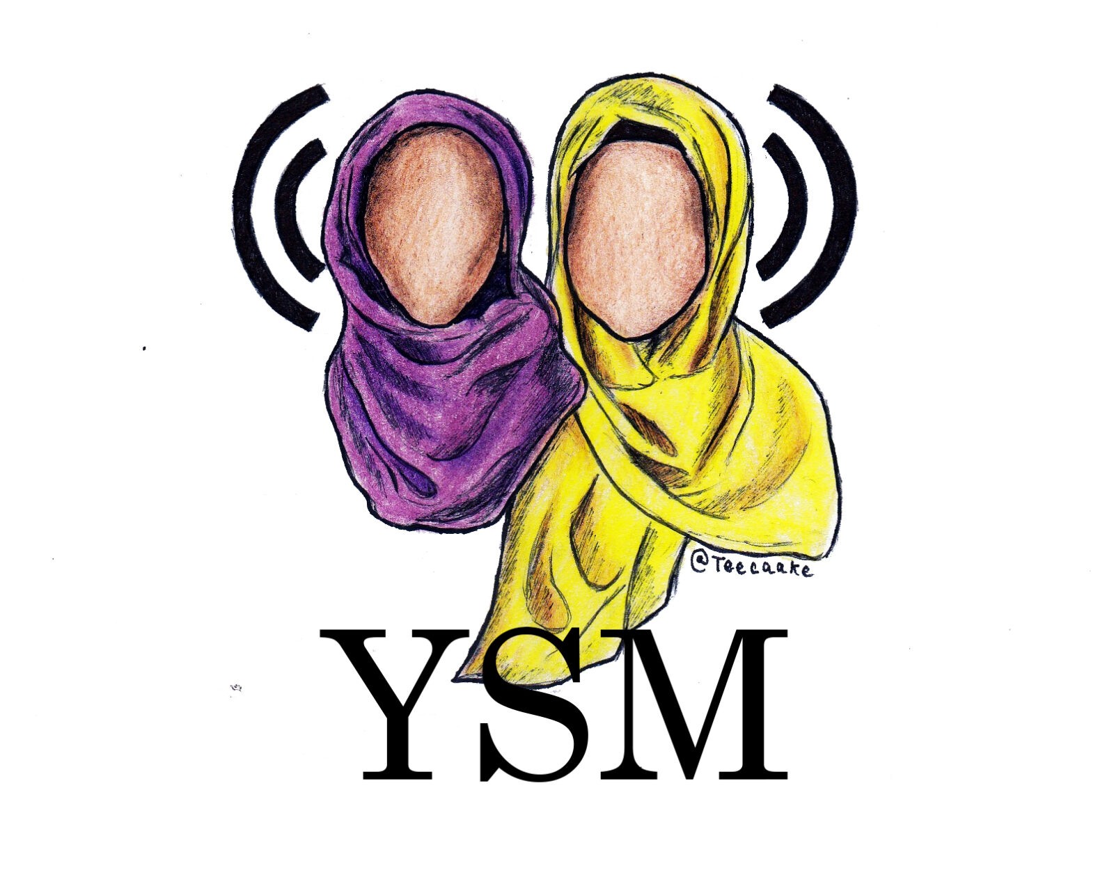
Along my journey, I have also had the fortune of designing other people’s logos for their blogs/sites/brands. My most proud logo achievement other than my own is the one I designed for my friend, Pauline, who is the owner of an incredible blog, www.pawlean.com. I have also designed logos for a podcast show as well as other blogs.

- Draw inspiration from logos of brands you like. Do not replicate their logo, but appropriate research is necessary if you want to understand what works and what doesn’t.
- Ensure simplicity. You don’t want to add too much detail because often, logos are downsized and the details won’t show up – instead it will make your logo look crowded and complex.
- Use clean bold lines. You want your logo to be recognisable just from the shape.
- Find a symbol that represents your brand. Often, this can be you/someone associated to your brand. (This is where I come in and can design your logo for you!) Symbols work really well as icons where your full logo isn’t visible.
- Use regular shapes. Make sure your logo is encapsulated in either a square, a circle or a rectangle with a 1:2 ratio. Irregular or unconventionally shaped logos don’t always work and although you might think you are trying to be unlike other brands, it’s sometimes not the way to go.
